Core Palette
The Datum core color palette was chosen to evoke a certain technological adventurism, combined with a grounded maturity that instills confidence.
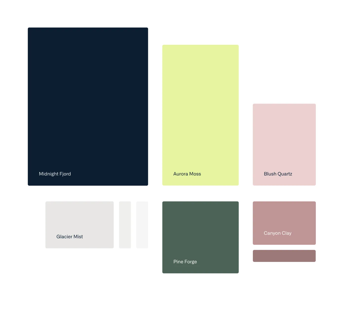
Midnight Fjord
Aurora Moss
Glacier Mist
Pine Forge
Canyon Clay
Blush Quartz
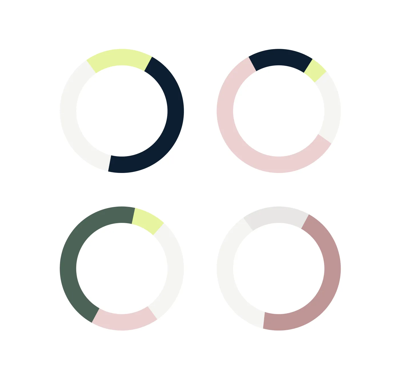
Color Weighting
Our colors are most effective when used with a clear sense of hierarchy. Choose one color to lead the composition, supported by one or two contrasting accents. Avoid giving every color equal weight, as this can reduce clarity and visual impact.
Secondary Palette
The secondary palette extends our core colors and provides additional flexibility when more variety is needed. Use these colors selectively for supporting graphics, illustrations, and content themes, rather than as a replacement for the core palette.
Ocean Swell
Heather Meadow
Spring Pasture
Utility Palette
The utility palette communicates status and feedback across all digital touchpoints. These colors have specific functional meanings and should be used consistently for states such as success, warning, error, information, and usage notes.
Alert red
Used for:
- Form errors
- Negative status badges
- Unsuccessful outcomes
Intermediate orange
Used for:
- Warnings
- Intermediate status badges e.g. 'Pending'
Success green
Used for:
- Confirmation messages
- Positive status badges
- Successful outcomes
Neutral blue
Used for:
- Information
- Neutral status badges
Help yellow
Used for:
- Background colour for boxes displaying information about the UI